ConsumerWeb is a platform for Consumers, and consumer law professionals to seek and help with redress on consumer matters. I gave myself the task of creating one of the easier layout pages for a web application: the sign-up page.
I had to bear in mind that this Web Application would be aimed at a broader audience who would be more conservative in their design tastes. The were some other accessability issues to consider:
1. Older Individuals may struggle to see, therefore the font must be plain, clear and highly readable.
1. Older Individuals may struggle to see, therefore the font must be plain, clear and highly readable.
2. I need to use paired-back to neutral colour tones, as bright colours would be a greater challenge to keep contrast between the font and the background colour.
3. Keeping the layout simple with a layout schema that people are already used to would make it easier for the user to navigate, reducing cognitive load.
4. Also, keeping the layout simple will reduce the amount of time and effort that the user would need to put in, making it more appealing for them to start the onboarding process.
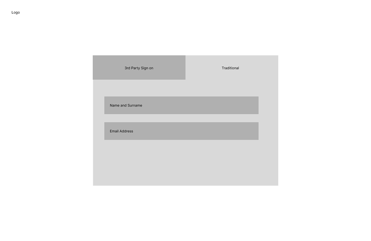
My first low-fidelity wireframe was this, The idea was to give the user two options to sign-up, but reduce cognitive load and reduce Hick's law effect on the user.
However, I realised when show my mum this wireframe, and older individuals' experiences with sign-in pages, that hidden and not clearly shown options often go missed and the benefit of the two options would disappear into thin air.
Therefore, I decided on a simpler, albeit more populated option for the sign-up page:

This option tested better, as the users have clearly defined options that are easily readable, seeable and actionable at a glance.
On the right handside, is a brief summation of what ConsumerWeb does and the features that the user can benefit from.
On the right handside, is a brief summation of what ConsumerWeb does and the features that the user can benefit from.
This can then further encourage the user to begin the sign-up process, as the benefits of sign-up are clearly defined on the left handside.

For the colour palette, I chose to go with green, as it represents optimism, motivation and is calming. These are all emotions that I want the user to feel as they sign-up. If they are on the ConsumerWeb platform, it is most likely that they are highly stressed because they are seeking redress for a faulty consumer product. Therefore, providing some visual design choices that provide some tranquility would ensure a better sign-up experience.

This is the completed high-fidelity version, I used the colour codes:
0F3923 at 100% opacity for
0F3923 at 100% opacity for
1. The outline of the text boxes;
2. The middle separating line;
3. and sign-up button background colour.
0F3923 at 50% capacity for:
1. The text boxes background colour;
06170E at 100% for:
1. Text colour of the summation on the left.
F9FFFC for
1. The background colour, as the background must always be lighter than the foreground to improve the legibility of text and make it easier to read for the user.
I used understated font families in both serif and sans-serif for the text called:
1. Quattrocento Sans: chosen for the body text. It has a modern look, but still fitting with the conservative needs of the user base the website and web application serves.
2. Quattrocento: Chosen for the heading text of ConsumerWeb, to blend the ideas of new and old, law and technology together onto one platform.
However, i found that the outlines of the text boxes made the sign-up page look dated, so I made a change to it that would highlight the sign-up areas, while also updating the look of the web page.

Adding in a box shadow effect also helped to emphasise the text areas, while also moving away from the flat-design ideology and move towards the idea of augmented reality on a screen.
The use of the icons for Facebook and Google also help the user to find familiar platforms and be able to intuitively know that they can sign-up with their chosen platforms.
It was important for me to keep the 'traditional' method of sign-up, as many people like to keep their profiles seperate. There is also an underlying premise, that when one puts the options of one-click sign-up as the only option, that the user would like to use a business or personal profile attached to the Google or Facebook Account, which is often not the case, shutting out a wide variety of legal professionals and consumers.
It was important for me to keep the 'traditional' method of sign-up, as many people like to keep their profiles seperate. There is also an underlying premise, that when one puts the options of one-click sign-up as the only option, that the user would like to use a business or personal profile attached to the Google or Facebook Account, which is often not the case, shutting out a wide variety of legal professionals and consumers.


